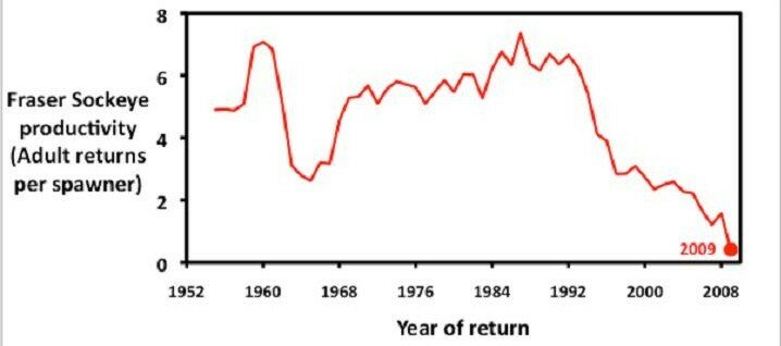
In reviewing the various articles, one of the points I didn’t see highlighted are the startling graphs from the ““. Again, not directed as criticism towards the think tank or individuals involved; however, the graphs paint a clear picture for me.
 This graph is showing sockeye salmon production in the Fraser. The steep red line running to the right hand bottom corner is worse than the steep red line to the bottom right corner of most of the world’s stock markets this time last year, or returns on most people’s RRSP.

This graph is showing the percentage of the sockeye salmon run caught in the Fraser. Harvested also means killed.
I’ll point out some of the things that stand obvious to me:
1. How and why fish ‘managers’ figured that catching 80% of a run for over 40 years (at least by this graph) is a good idea – or sustainable – blows my mind.
At some point in time, the assumption that leaving 20% of a salmon run to produce the same size runs year after year was going to fall apart. Salmon are not wheat or canola or trees, and the ocean is not some pasture that produces the same results every year.
That’s part of the problem we have now. (However this is not a rant on the concept of maximum sustainable yield.)
2. Compare the falling red line of the production graph with the not-so-falling blue line of the catch graph. If the runs were continuing to fall through the mid-1990s and into the 2000s then why did the salmon killing jump back up to around 60% in the early 2000s? I’d like to know who was responsible for that set of bonehead decisions.
3. If scientists have known for at least the last decade that ocean conditions were changing (I was coming across research in the late 1990s that suggested ocean conditions were changing/declining) – and that Fraser sockeye runs were on massive declines – then, again, who made the decisions to kill between 20-40% of the run through the early 2000s?
One has to wonder if the upcoming judicial inquiry will actually name names?
(highly doubtful).

